Sunnylands
Redesigning the digital presence of the Annenberg estate to bridge the gap between historical prestige and modern usability, significantly reducing support volume through intuitive navigation and visual booking.
The brief 🔎
Prompt
Sunnylands, the historic 200-acre Annenberg estate and international retreat center, required a website refresh that matched the beauty of the physical property while maintaining its status as a site of global importance. The primary goal was to modernize the interface and surface critical visitor information—like tour availability and timings—to reduce reliance on their call center.
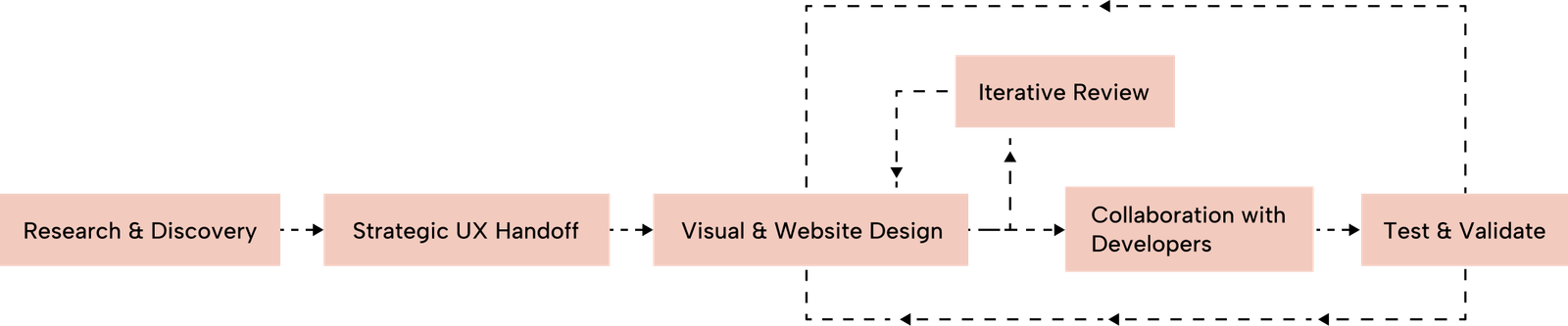
Design Process
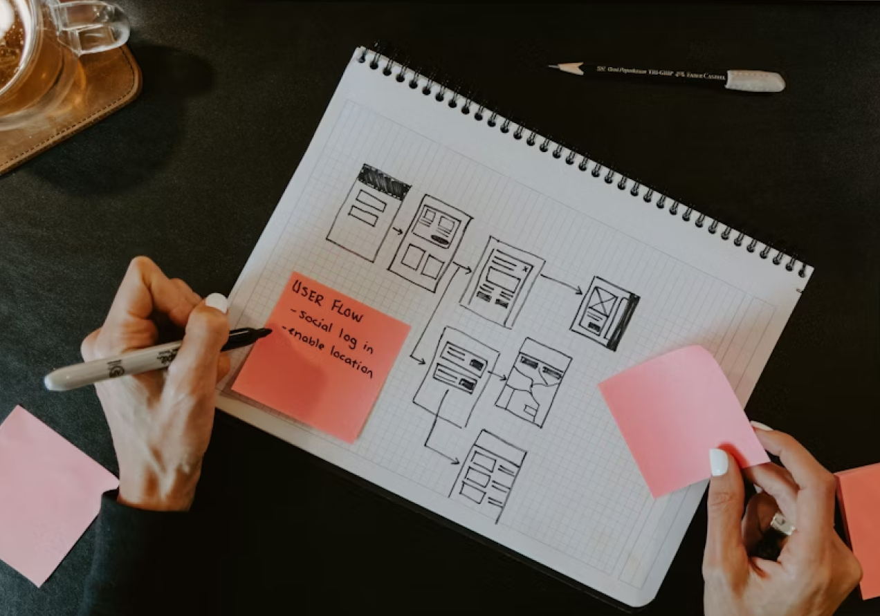
Collaborating within a multi-disciplinary team, I focused specifically on the Website Design phase. My process involved taking UX blueprints from colleagues and transforming them into high-fidelity, responsive designs. I maintained bi-weekly client meetings and daily team standups to ensure every design choice was technically feasible and aligned with the broader product vision.
Target Users
- The Global Contributor: Researchers and leaders looking for historical context, "Convenings" impact, and high-level networking, requiring a data-rich and accessible mobile experience.
- The Local Community: Residents and tourists seeking leisure activities, nature, and art, who prioritize simple navigation and visual booking tools.
How Might We Questions
To guide the redesign, I focused on these core challenges:
- HMW elevate the website's visual identity to match the estate's beauty while maintaining its status as a serious global retreat?
- HMW restructure the information hierarchy so that visitors find tour timings and guidelines without needing to call the support center?
- HMW create a 100% accessible digital experience that serves both young researchers and elderly local visitors equally?
- HMW transform complex scheduling data into a glanceable, intuitive visual calendar?
research 🔬
Background Research
The project began with an audit of the existing site, which felt outdated and buried essential information. Research focused on how world-class cultural landmarks and historic estates balance "prestige" with "utility" in their digital experiences.
Research Goals
- Identify why visitors were calling for basic information despite it being on the site.
- Establish an aesthetic that reflects the property’s physical architecture.
- Achieve a perfect 100 score in Lighthouse accessibility audits.
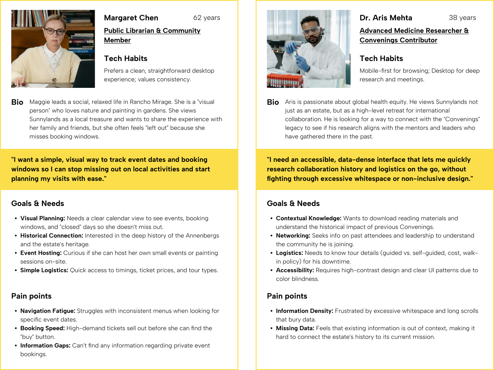
User Personas
I used research data to create user personas for our ideal users, capturing their characteristics, preferences, and needs. These personas inform our product development and design strategies.

User Research Insights
The Tourist: Needs quick access to ticket availability and visiting hours.The Visual Learner: Struggles with text-heavy lists and prefers seeing availability on a calendar.The Multi-Generational User: Ranging from students to seniors, requiring high legibility and intuitive navigation.
How these personas informed the design
To bridge the gap between Aris and Maggie, I focused on two specific UI/UX improvements:
For Aris: Accessibility & Data: I utilized a high-contrast palette and ensured that information was grouped logically in "cards" to reduce the need for excessive scrolling. The perfect 100 Lighthouse score was a direct response to his need for an accessible mobile experience.For Maggie: Visual Planning: The introduction of the Interactive Calendar was the solution to her "missing the window" pain point. By color-coding availability and clearly marking "Closed" days, she can now plan her social visits at a glance without having to call the center.
Problem 🤔
Research Findings & Painpoints
- Information Obscurity: Critical details like opening times and tour availability were not displayed upfront.
- Visual Deficit: A lack of images and interactive elements made it difficult for users to comprehend tour options.
- Support Overhead: The "trial-and-error" nature of finding ticket availability led to a high volume of preventable phone calls to the visitor center.
- Booking Friction: A lack of visual elements like calendars made it difficult for users to understand tour availability at a glance.
- Accessibility Gaps: The older site lacked the inclusive design standards necessary for a diverse, international audience.
Problem Statement
Visitors struggle to find and book tours independently due to an outdated interface and poor information hierarchy, resulting in an over-reliance on phone support and a disconnect from the estate’s physical beauty.
final design 👩🏼🎨
Design Decision
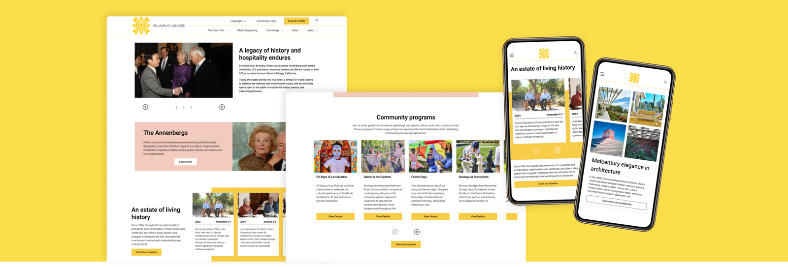
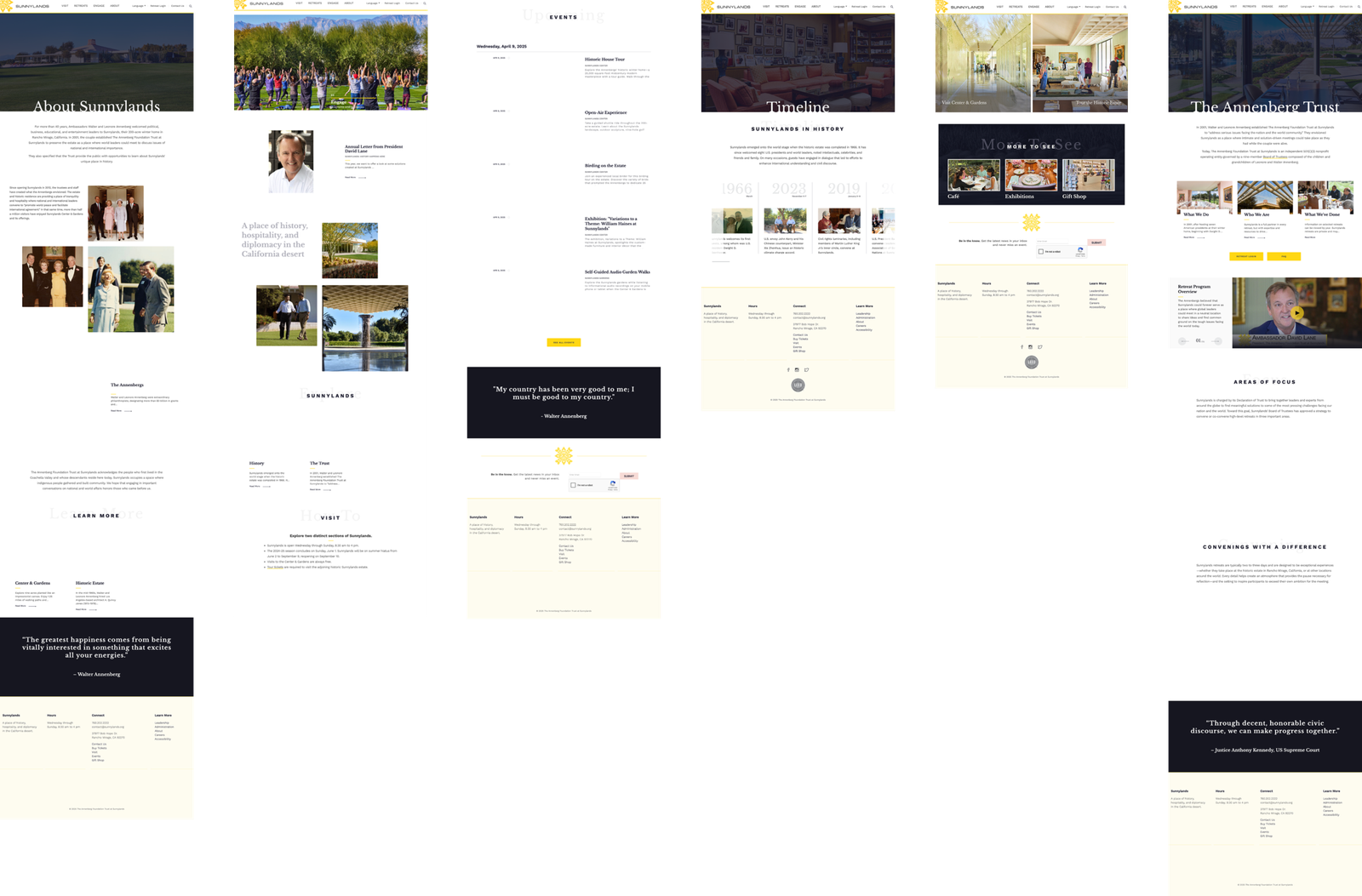
The direction focused on a "clean and informative" aesthetic. We moved away from text-dense pages to a high-imagery, spacious layout that mirrors the openness of the 200-acre estate.
Visual Identity
- Dynamic Navigation: A completely restructured menu that is simplified yet more informative, allowing users to find "Tours" and "History" instantly.
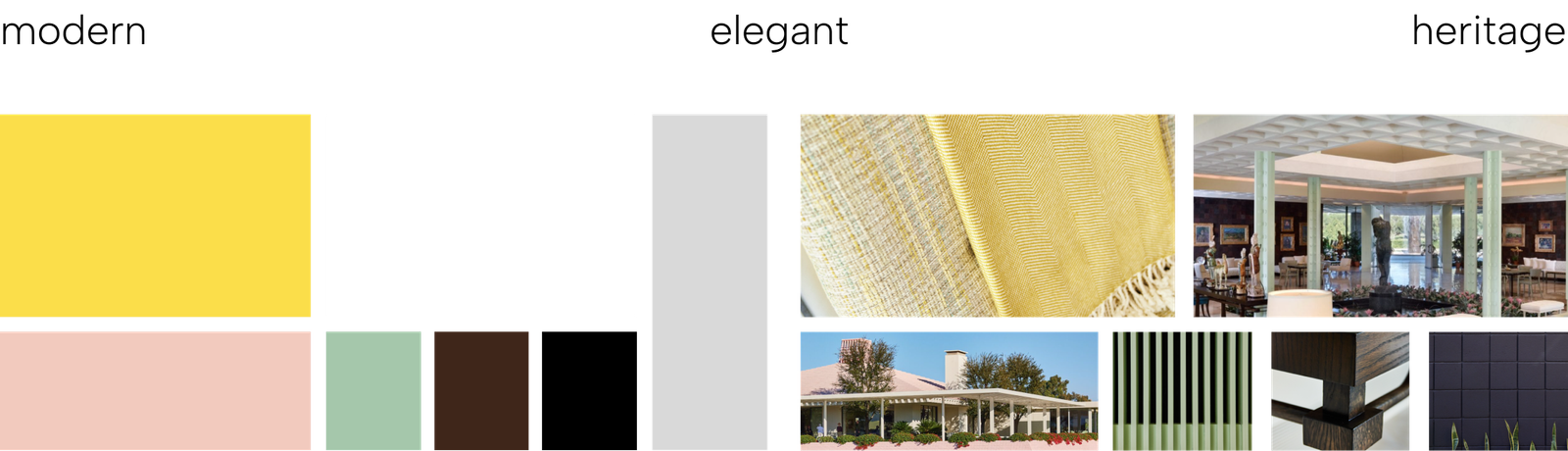
- Expanded Palette: Beyond the traditional brand yellow, I introduced colors inspired by the estate's mid-century modern architecture and lush desert nature.
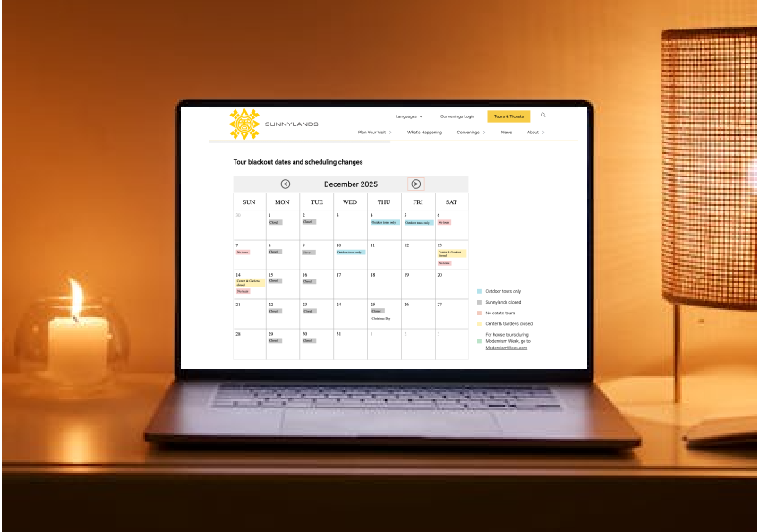
- Visual Clarity: Replaced "blackout date" lists with a color-coordinated calendar view, using symbols to simplify complex availability status.
Color Palette
The visual identity was deeply rooted in the iconic heritage of Sunnylands. I drew heavy inspiration from the mid-century modern architecture and the signature A. Quincy Jones interiors, ensuring the digital experience felt like a natural extension of the physical estate. By integrating the specific textures and geometric patterns found within the house—paired with a color palette pulled directly from the surrounding desert landscape—the design maintains a sophisticated "period" feel. This approach allowed me to honor the site's historical prestige while delivering a contemporary, high-performance interface that feels both timeless and fresh.
Prototype
These comparisons highlight the transition from a dated, static interface to a vibrant, high-performance experience. Every section was reimagined to balance historical prestige with modern digital standards.
- Utilized the full breadth of the new color palette with intent. By introducing the brand’s Yellow (previously neglected), I replaced dull layouts with high-energy, high-contrast sections that command attention.
- Established a sophisticated balance between immersive imagery and clear typography, moving away from text-heavy blocks to a more editorial feel.
- Integrated horizontal scrolls to showcase content more interactively. This not only increased engagement but also significantly reduced page length and vertical scrolling fatigue.
- Engineered a completely new footer that organizes even more information than the original into a compact, highly scannable footprint.
The Original Site
The Redesign
Navigation: Dynamic & Scalable Architecture
To improve discoverability and reduce user friction, the navigation was completely restructured into a dynamic, responsive system. Designed for maximum flexibility, the new architecture allows the client to customize sections with intro headers, sub-pages, and featured articles—all with or without supporting imagery.
Key Enhancements:
- UX-Driven Labels: Page naming and hierarchy were reimagined based on research to ensure users find essential information upfront.
- Media-Rich Menus: Integrated support for images within the navigation to provide visual context for tours and estate history.
- Cross-Platform Consistency: A seamless transition between the simplified desktop megamenu and the intuitive mobile interface.
Tours & Tickets: Visual Scheduling & Information Hierarchy
The redesign of the Tours & Tickets page focuses on eliminating user confusion by centralizing critical data into a high-clarity, unified interface. By establishing a logical information hierarchy, the new layout ensures that logistical details are accessible and easy to digest.
Key Enhancements:
- Interactive Calendar View: Replaced complex text lists with a consolidated visual calendar. This allows visitors to see blackout dates, tour availability, and estate closures at a glance—addressing a primary pain point for visual learners.
- Component-Based Clarity: Dedicated sections for Announcements, Ticket Guidelines, and Group Visits provide essential context before the user begins the booking process.
- Branded Highlights: Strategic use of the color palette to emphasize important notices and accessibility information, ensuring critical details stand out while maintaining a premium brand feel.
user testing 🦸
Results & User Testing Feedback
- Accessibility Milestone: Achieved a perfect 100 Lighthouse score for both mobile and desktop accessibility.
- Support Reduction: The new calendar view and upfront information led to a measurable decrease in call center inquiries.
- Intuitive Booking: User feedback indicated that the "Tours & Tickets" experience is now straightforward, with the visual calendar cited as a major benefit for planning visits.
Takeaways 🎁
Working on Sunnylands taught me the importance of balancing heritage with high performance. While the estate is historic, the website needed to feel cutting-edge to serve a modern audience. I also learned the value of constant developer and stakeholder feedback. By keeping my team in the loop through weekly updates, we avoided designing in a vacuum and ensured that the complex calendar features I designed were fully implementable within the project timeline.
Keep Reading
More examples of design that drives results.