International Transaction Compliance
I designed a real-time cancellation flow for international wire transfers to comply with new US government mandates. The challenge was to provide a 30-minute "undo" window for users while preventing receipt fraud and managing the technical lag of global payment rails.
The brief 🔎
Prompt
To comply with new US federal regulations, the bank needed to allow users to cancel international transactions within a 30-minute window. As the sole designer, I was tasked with creating a native mobile experience that balanced this new user right with the bank's need for security and fraud prevention.
Design Process
I followed an iterative human-centered Design (HCD) approach. Given the high-risk nature of the project and a team spread across three timezones, I focused heavily on collaborative discovery, detailed documentation, and rigorous verification of edge cases with risk and engineering teams.
Target Users
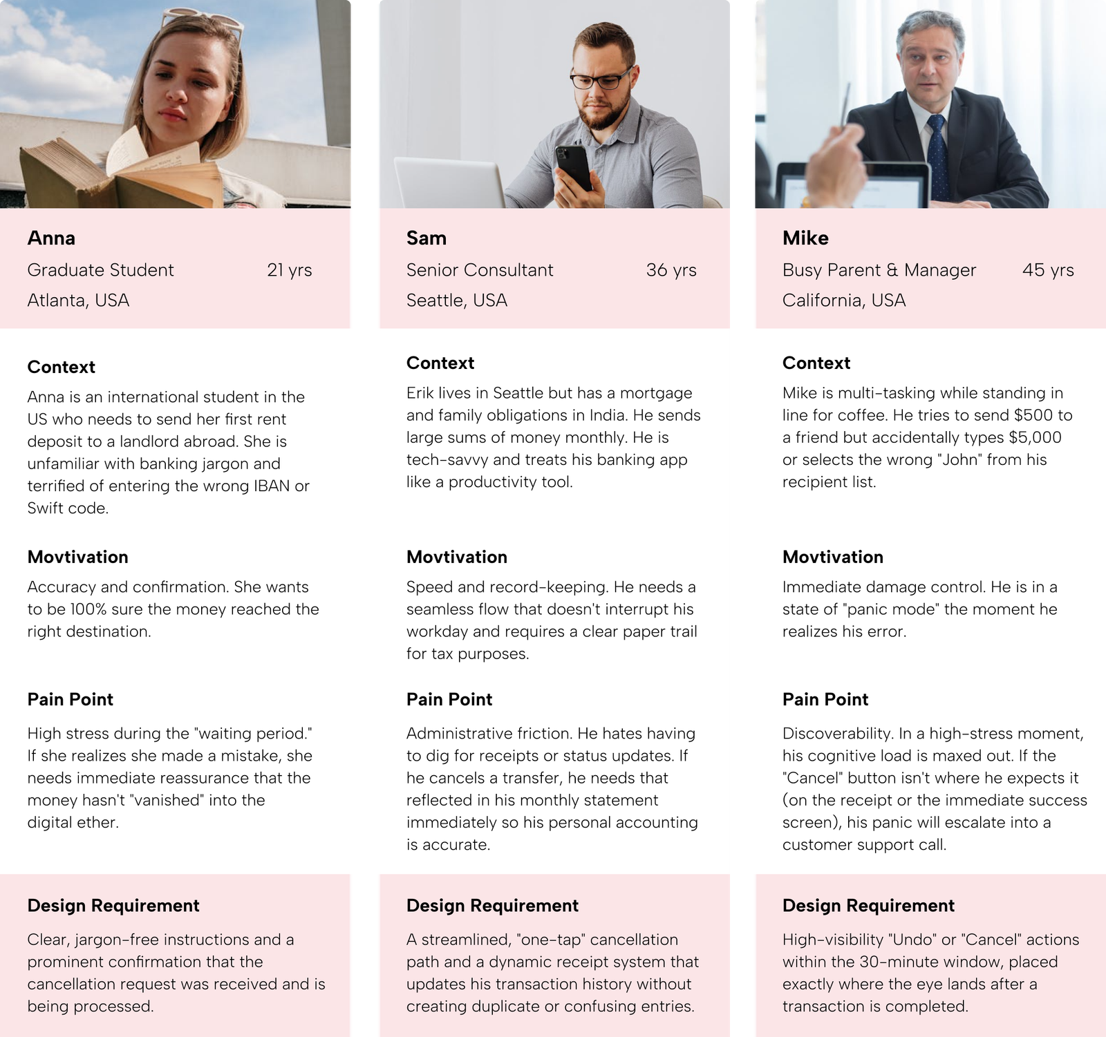
To ensure the solution worked for everyone, I focused on three primary personas:
- First-time Senders: Users who are unfamiliar with the complexities of international wire transfers and need high levels of guidance and reassurance.
- Expatriates & International Professionals: Power users who send money frequently and prioritize speed, accuracy, and clear record-keeping for tax or personal reasons.
- The "Accidental Sender": Users who have made a mistake (wrong amount or recipient) and are in a high-stress state, needing a "panic button" that is easy to find and use.
Research Methods
- Stakeholder Interviews
- Competitive Benchmarking
- User Journey Mapping
How Might We Questions
- HMW make the 30-minute window prominent without causing anxiety for successful senders?
- HMW prevent the misuse of "Confirmation" receipts to protect the bank from fraud?
- HMW simplify the receipt management process so users can distinguish between active and cancelled transfers at a glance?
research 🔬
Background Research
I began by analyzing the new government mandate to understand the legal boundaries. This required studying how international payment rails (like SWIFT) handle real-time cancellations and what specific data points were legally required to be shown to the user during the 30-minute window.
Research Goals
- Identify user friction points in the existing transaction history.
- Understand the technical limitations of "reverting" a live payment.
- Identify potential fraud loops created by allowing instant cancellations.

Stakeholder Interviews
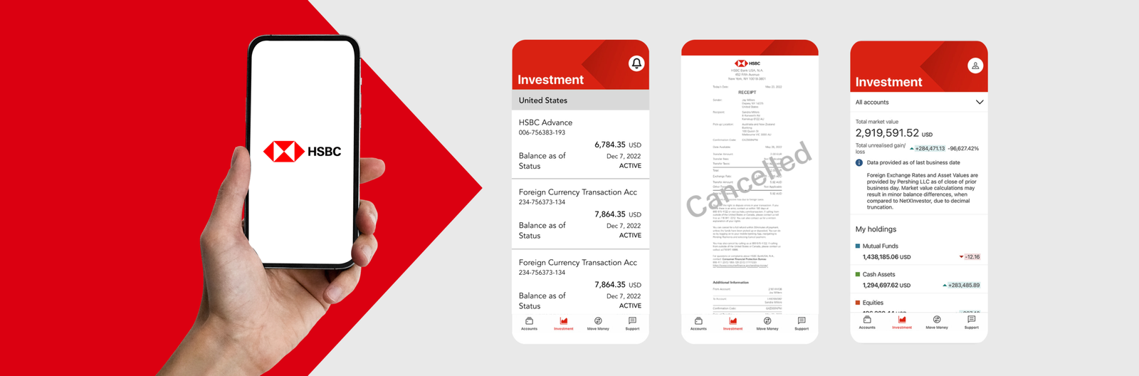
Through deep-dive sessions with Payments, Risk Management, and Business stakeholders, I decoded the complex technical and legal guardrails of the project. These interviews uncovered a critical business vulnerability: a 'Confirmation' receipt could inadvertently become a tool for fraud if a user cancelled the transaction but retained the original proof of payment. This insight shifted the project’s focus from a simple 'cancel' button to a dynamic receipt management system that protects both the bank and the user.
Q. What is the biggest risk of allowing a 30-minute cancellation?
Risk Team: "The Receipt Loophole. If a user cancels but keeps a valid-looking 'Success' receipt, they can use it as fake proof of payment to a third party."Decision: I introduced Dynamic Receipts that visually "void" themselves in real-time once cancelled.
Q. Can the system handle a 'revert' immediately?
Engineering: "There is a 2-3 minute lag between the user clicking cancel and the ledger updating."Decision: I designed a "Pending Cancellation" state to manage user expectations during that technical lag.
Competitive Benchmarking
I analyzed the international transfer flows of a major global competitor to identify industry gaps and opportunities for improvement.
| Feature | Competitive Bank | Our Solution |
|---|---|---|
| Cancellation Visibility | Buried in "Help" or "Support" sections. | Prominent on the Transaction Receipt itself. |
| Live Status | Static "Pending" status for 24 hours. | Separate tab for ‘Pending International Transactions’. |
| Proof of Cancellation | No specific receipt for cancelled items. | Updated Digital Receipt with a "Cancelled" watermark. |
| User Guidance | Generic "Transaction Failed" message. | Clear, contextual messaging explaining why and how the refund is processed. |
Feature: Cancellation Visibility
Competitive Bank: Buried in "Help" or "Support" sections.
Our Solution: Prominent on the Transaction Receipt itself.
Feature: Live Status
Competitive Bank: Static "Pending" status for 24 hours.
Our Solution: Separate tab for ‘Pending International Transactions’.
Feature: Proof of Cancellation
Competitive Bank: No specific receipt for cancelled items.
Our Solution: Updated Digital Receipt with a "Cancelled" watermark.
Feature: User Guidance
Competitive Bank: Generic "Transaction Failed" message.
Our Solution: Clear, contextual messaging explaining why and how the refund is processed.
User Personas
I used research data to create user personas for our ideal users, capturing their characteristics, preferences, and needs. These personas inform our product development and marketing strategies.
Problem 🤔
Research Findings & Painpoints
Through my research and stakeholder sessions, I identified three critical friction points that defined the project's complexity:
- The "Receipt Loophole": Risk management identified that a static PDF receipt is a liability. If a user cancels a transaction but keeps a "Successful" receipt, it becomes a tool for fraud.
- Hidden Actionability: The cancellation option was buried deep in sub-menus, making it nearly impossible for the "Accidental Sender" to act within the 30-minute legal window.
- Status Ambiguity: Users often confused a "Pending" status with a "Cancelled" status, leading to repeated support calls to verify if their money was actually safe.
Problem Statement
Users need a high-visibility, low-friction way to exercise their legal right to cancel international transfers, while the bank requires a system that invalidates proof-of-payment the moment a cancellation is initiated.
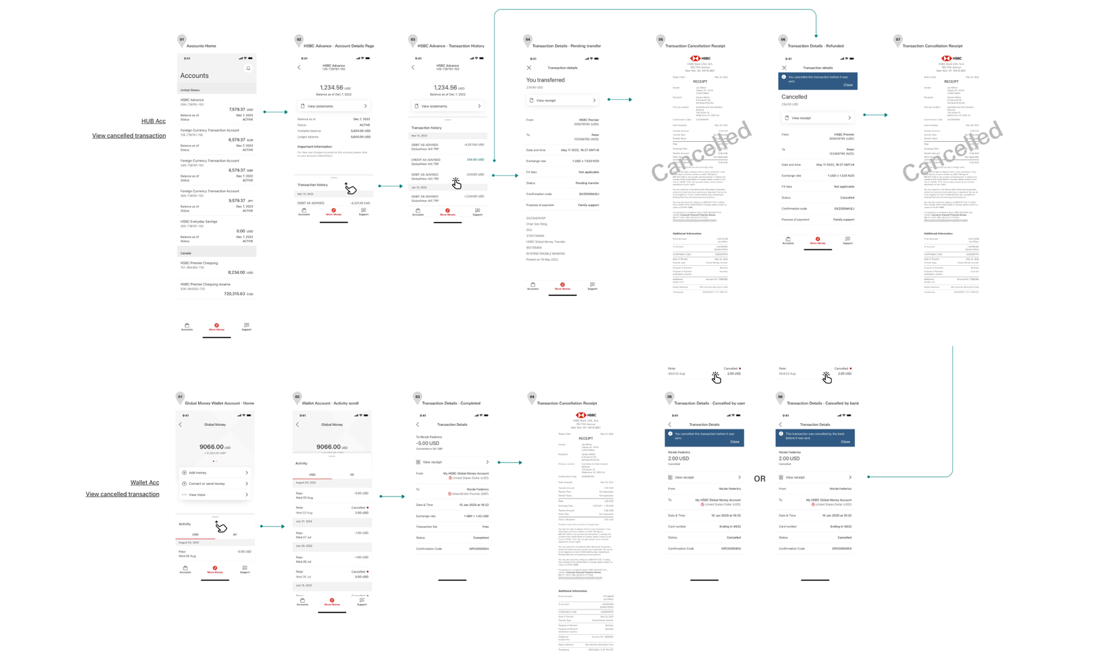
Userflows
Presented below is a concise overview of the user journey for the three different profiles, indicating the specific pages accessible under each user's login.
final design 👩🏼🎨
Design Decision
The primary goal was "Immediate Certainty." Given the high-stakes nature of international transfers, the UI needed to feel authoritative and secure. I focused on reducing cognitive load by prioritizing real-time status updates and ensuring the "Cancel" action was accessible yet clearly distinguished from standard navigation.
Visual Identity
To ensure a seamless user experience within the existing ecosystem, the visual language was strictly aligned with the HSBC Global Design System.
- Typography & Palette: I utilized the core HSBC brand fonts and color palette, ensuring all text met AA/AAA accessibility standards for high-contrast readability.
- UI Components: All buttons, input fields, and navigation patterns were pulled from the existing library to maintain platform consistency across iOS and Android.
- System Notifications & Warnings: I leveraged standardized warning patterns and iconography for the "30-minute window" alerts. By using familiar system patterns, I ensured that users could instinctively recognize the urgency and importance of the cancellation window without introducing new, confusing visual elements.

Prototype
I developed high-fidelity prototypes to test the logic of the dynamic receipt transition. This allowed stakeholders to see exactly how the HSBC-branded components reacted when a transaction moved from "Pending" to "Cancelled," ensuring the visual feedback was instantaneous and unmistakable.
Impact
The project successfully launched into a highly regulated market, balancing federal mandates with enterprise-level security for millions of users.
- Compliance at Scale: Delivered a federally mandated feature on time for millions of native iOS and Android users.
- Risk Mitigation: Prevented high-value fraud by proactively closing receipt loopholes during the design phase.
- Global Efficiency: Streamlined cross-functional handoffs across three timezones through a centralized "Source of Truth" document.
- Improved Clarity: Reduced user anxiety and support volume by transforming complex legal requirements into a transparent UI.
Takeaways 🎁
Operating as the sole designer within a massive institution like HSBC taught me that at the enterprise level, design is a form of risk management. By identifying the "Receipt Loophole" early, I prevented significant potential fraud—proving that a designer’s most valuable skill is often their ability to anticipate business vulnerabilities.
Working with a vast team of Business, Risk, and Tech stakeholders, I learned to move beyond "design-speak" to gain executive buy-in, framing my decisions around regulatory safety and business impact. To manage the complexity across three timezones, I developed a centralized "Source of Truth" document. This became my most important deliverable; it eliminated communication gaps and ensured that 100% of the edge cases were built as intended. Ultimately, this project showed me how to drive high-level impact within a global organization by turning a rigid legal constraint into a feature that builds deep user trust.
Keep Reading
More examples of design that drives results.