
Change Customer Contact Details
I optimized the contact update flow to address technical constraints where specific fields were restricted to either landline or mobile numbers. The goal was to reduce high user error rates by shifting from a "trial-and-error" submission model to a proactive, guidance-first experience.
The brief 🔎
Prompt
The goal was to modernize the profile management section of the HSBC mobile app, allowing users to add, edit, or delete their contact details. The primary challenge was navigating complex backend limitations: certain fields only accepted mobile numbers, while others were restricted to landlines, often leading to high error rates and user frustration.
Design Process
I followed a lean design approach, focusing on system auditing and rapid prototyping. Since the requirements were clearly defined by the business, I pivoted quickly from discovery to implementation, utilizing the HSBC Global Design System to ensure brand alignment and speed to market.
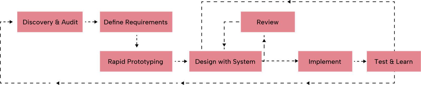
Discovery & Constraints
Note: While formal user research wasn't conducted, I performed a heuristic audit and stakeholder discovery to map the technical guardrails and define our user archetypes.
Target Users
To ensure the layout was intuitive, I focused on three primary user scenarios:
- Someone who recently Relocated: Users who have moved and need to update multiple touch points (Home, Work, and Mobile) quickly and accurately.
- The International Resident: Users who maintain both a local mobile number and a landline in their home country, requiring clear distinction between phone types for verification purposes.
- The "Update-Only" User: Someone who just changed their primary mobile device and needs a "quick-hit" experience without any friction or input errors.
How Might We Questions
- HMW surface strict technical constraints (like Landline vs. Mobile) without cluttering the mobile interface?
- HMW reduce the "trial-and-error" loop where users only discover an error after hitting the save button?
- HMW leverage the existing HSBC design system to create a "self-explanatory" form that requires zero external help?
research 🔬
Research Goals
- Identify why users were triggering high volumes of "Invalid Format" errors.
- Determine the most effective way to communicate field-specific rules without cluttering the mobile UI.
Problem 🤔
Painpoints
- Input Ambiguity: Users often tried to enter mobile numbers into landline-only fields because the distinction was not surfaced until after they hit save.
- Invisible Rules: Important constraints were hidden behind info icons or "i" buttons, requiring extra taps and cognitive load.
- Validation Fatigue: Error messages appeared at the end of the flow, forcing users to backtrack and re-enter data.
Problem Statement
Users need to understand the specific formatting and device requirements for contact fields before they begin typing to avoid validation errors and ensure their profile is successfully updated.
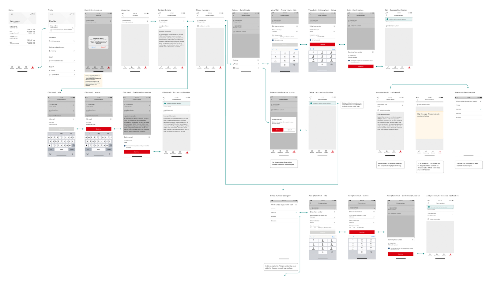
Userflows
I mapped out a "Success-First" flow, where validation happens in real-time, and the user is guided by persistent hints that disappear or change state as they type.
final design 👩🏼🎨
Design Decision
The core philosophy was to eliminate guesswork. Instead of hiding rules inside clickable icons, I moved critical information to the surface.
Visual Identity
I leveraged the HSBC Global Design System to maintain a cohesive look and feel.
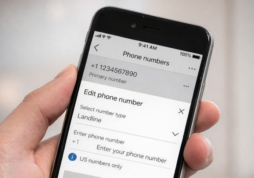
- Persistent Help Text: I used standardized micro-copy placed directly below the field labels. These labels clearly stated "Mobile Only" or "Landline Only."
- Mandatory Markers: I used consistent "Required" tags to remove any doubt about which fields were essential for the update.
- HSBC Asset Integration: All components—from text fields to the "save" button—were pulled directly from the HSBC library, ensuring the solution was both brand-compliant and development-ready.

Prototype
I created a high-fidelity prototype that demonstrated the "Proactive Guidance" model. By showing the constraints upfront, the prototype showed a significant reduction in the time it took for a user to complete their profile update compared to the previous hidden-info model.
user testing 🦸
User Testing Feedback
During internal walkthroughs and small-group testing.
- Higher Confidence: Users reported feeling more "sure" of what they were typing because the rules were visible without extra interaction.
- Reduced Errors: The "Upfront Information" approach led to a 0% error rate during the test sessions, as users self-corrected based on the persistent labels.
Takeaways 🎁
This project taught me that at a big company like HSBC, not every project needs deep research to be a success. Sometimes, the best solution is just a smart, lean execution of very direct requirements. It really changed my workflow—instead of jumping to create something new, I learned to look at our design system first and ask, "Do I really need a new asset, or can I use what’s already here?" Sticking to the HSBC library allowed me to move much faster while keeping everything consistent. I also realized that in banking, clarity beats minimalism every time.
Keep Reading
More examples of design that drives results.