SAFE Project
Redesigning the digital presence of the Annenberg estate to bridge the gap between historical prestige and modern usability, significantly reducing support volume through intuitive navigation and visual booking.
The brief 🔎
Prompt
SAFE Project is a national leader in addressing the addiction epidemic through evidence-based programs. Their existing website struggled with "legacy cruft"—outdated components and a cluttered structure that made it difficult for users to find life-saving resources. My objective was to modernize the visual identity and create a flexible, component-based design system that could organize vast amounts of information without overwhelming the visitor.
Design Process
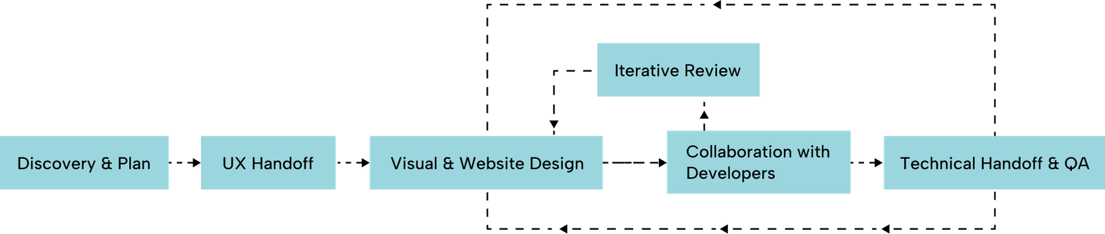
I led the Website Design phase of this end-to-end project, which followed a structured path from discovery to launch.
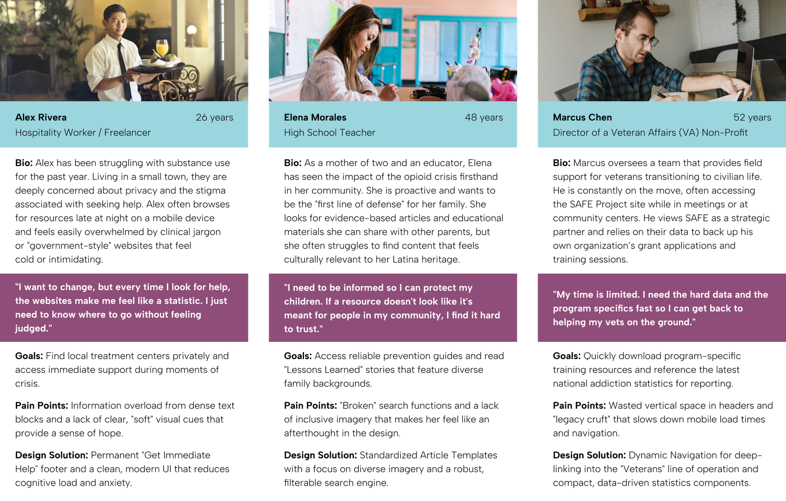
Target Users
The SAFE Project serves a diverse national audience, ranging from individuals in crisis to professional partners. The redesign focuses on high-contrast accessibility and a clear information hierarchy to ensure users find support regardless of their technical device or emotional state.
- The Hesitant Seeker: Individuals struggling with substance use who need immediate, private, and judgment-free access to treatment options and emergency support.
- The Informed Parent: Concerned family members seeking educational resources, prevention tools, and relatable stories to help navigate the addiction epidemic.
- The Professional Partner: Fellow NGOs and community leaders who coordinate with SAFE's lines of operation to share evidence-based training and program data.
How Might We Questions
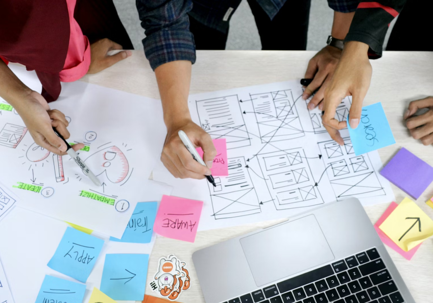
To translate the research and personas into actionable design goals, I focused on these How Might We (HMW) statements. These served as the guiding principles for the visual and structural decisions made during the redesign.
- HMW restructure the information architecture so that individuals in crisis (like Alex) can access the "Get Help" helpline within a single click from any page?
- HMW transform text-heavy pages into a balanced, component-based system that is easy for parents (like Elena) to read and navigate?
- HMW improve visual representation so that diverse users see themselves reflected in the imagery and feel a sense of belonging?
- HMW optimize internal page headers and navigation to reduce "wasted space," allowing professional partners (like Marcus) to find program data quickly?
- HMW design a robust, filter-based search experience that accounts for variations in terminology and provides immediate, relevant results?
research 🔬
Background Research
The team audited the current site and discovered "legacy cruft"—obsolete design components that limited engagement. We analyzed how peer organizations handled sensitive topics to find a balance between seriousness and hope.
Research Goals
- Organize "SO MUCH STUFF" into a standardized, scannable format.
- Improve search functionality to move beyond exact-word matching.
- Ensure the site reflects a diverse audience to avoid alienating specific demographics.
User Personas
I used research data to create user personas for our ideal users, capturing their characteristics, preferences, and needs. These personas inform our product development and design strategies.
User Research Insights
- Staff Feedback: The site is a primary tool for sharing trainings and awareness, but similar offerings were scattered rather than collected.
- User Voice (Diversity): One Latina user noted, "Nothing about this page jumps out and says me... when I come to a website I want to see—does someone look like me?"
- Visual Fatigue: Users felt the large "blue box" headers on internal pages were overkill and wasted valuable screen real estate.
Problem 🤔
Research Findings & Painpoints
- Information Overload: A lack of hierarchy meant users had to browse unnecessarily to find simple answers.
- Lack of Representation: Imagery didn't always feel relatable or inclusive, and sometimes felt "depressing."
- Rigid Templates: The client had no freedom to customize layouts, leading to a lack of cohesion between different article series.
Problem Statement
The SAFE Project website fails to effectively deliver life-saving resources because its outdated, text-heavy design creates a high cognitive load and lacks the inclusive visual representation necessary to reach all communities impacted by addiction.
final design 👩🏼🎨
Design Decision
The visual strategy was built to align with SAFE Projects’ mission of taking meaningful action through evidence-based, non-partisan programs. The goal was to shift the digital identity from a text-heavy, outdated resource hub to a vibrant, modern platform that feels both professional and welcoming.
Visual Identity
- Expanded Color Palette: I broadened the existing brand identity by introducing secondary colors that complement the original logo. We intentionally avoided yellow—a common choice in this sector—to ensure a unique and sophisticated presence in the non-profit space.
- Relatable & Inclusive Imagery: Following user feedback emphasizing the need for representation ("I want to see—does someone look like me?"), I established new photography guidelines. These prioritize diversity and authentic representation to ensure every visitor feels a sense of belonging.
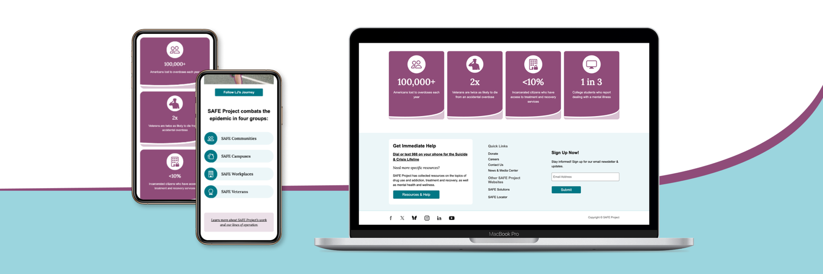
- Optimized Hero Banners: To address staff feedback regarding "wasted space," I reduced the scale of internal headers. This allows users to access primary content and titles immediately without unnecessary scrolling.
- Flexible Component Library: I designed a suite of generic components with balanced text-and-image combinations. This gives the SAFE Project team the freedom to customize layouts for unique series like "Our Stories" while maintaining brand cohesion and WCAG accessibility compliance.
- Iconography: Created custom icons for the four core groups (Communities, Campuses, Workplaces, Veterans) with subtle hover animations to encourage exploration.
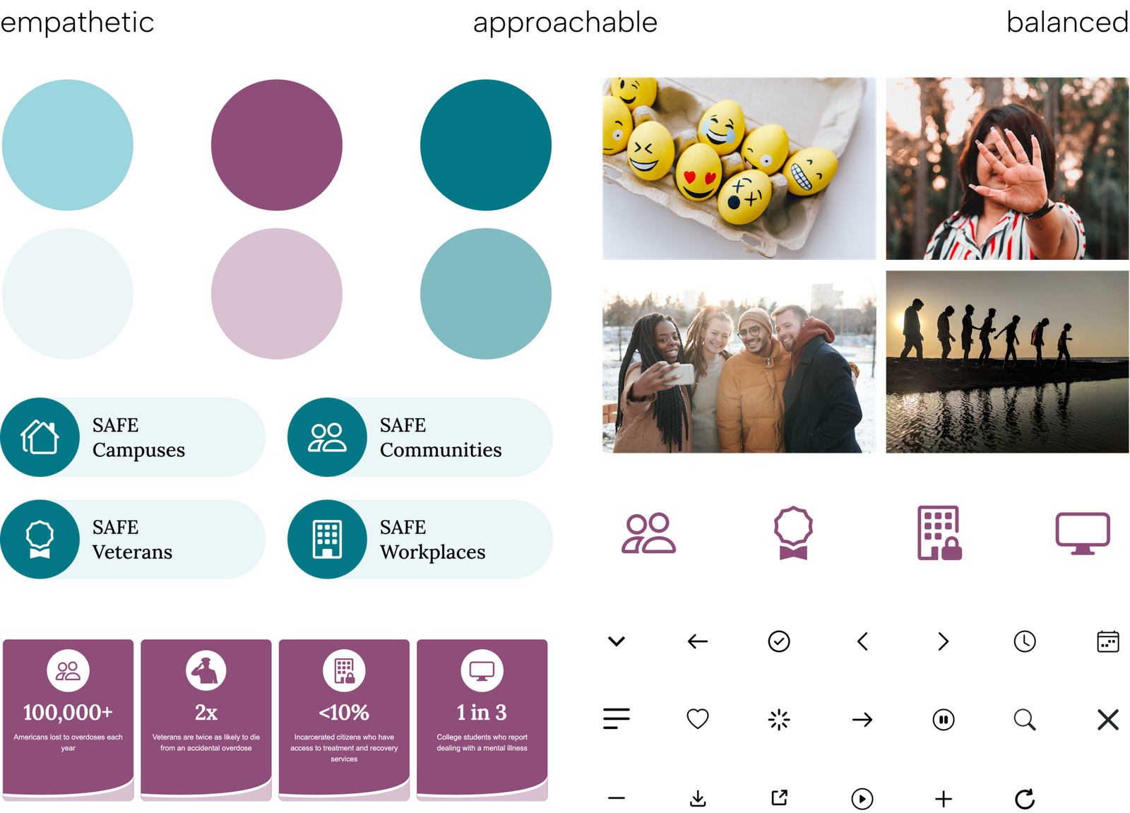
Key Components
- Dynamic Navigation: A highly flexible "Mega Menu" system that supports basic sub-pages, intro text, and media-rich links.
- The "Immediate Help" Footer: A permanent, highlighted section dedicated to the emergency helpline.
- Flexible Layouts: Created balanced text-and-image components that allow the client to build "showstopping" displays without breaking the design system.
- Data Visualization: A dedicated section for statistics to make the impact of the epidemic—and SAFE's work—instantly understandable.
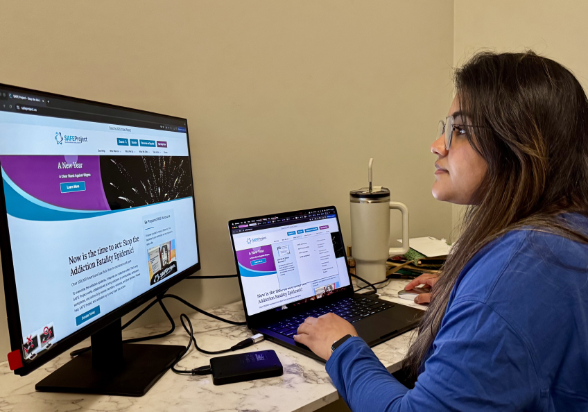
Prototype
These comparisons below, highlight the transition from a dated, static interface to a vibrant, high-performance experience. Every section was reimagined to balance the gravity of the mission with modern digital standards.
The Original Site
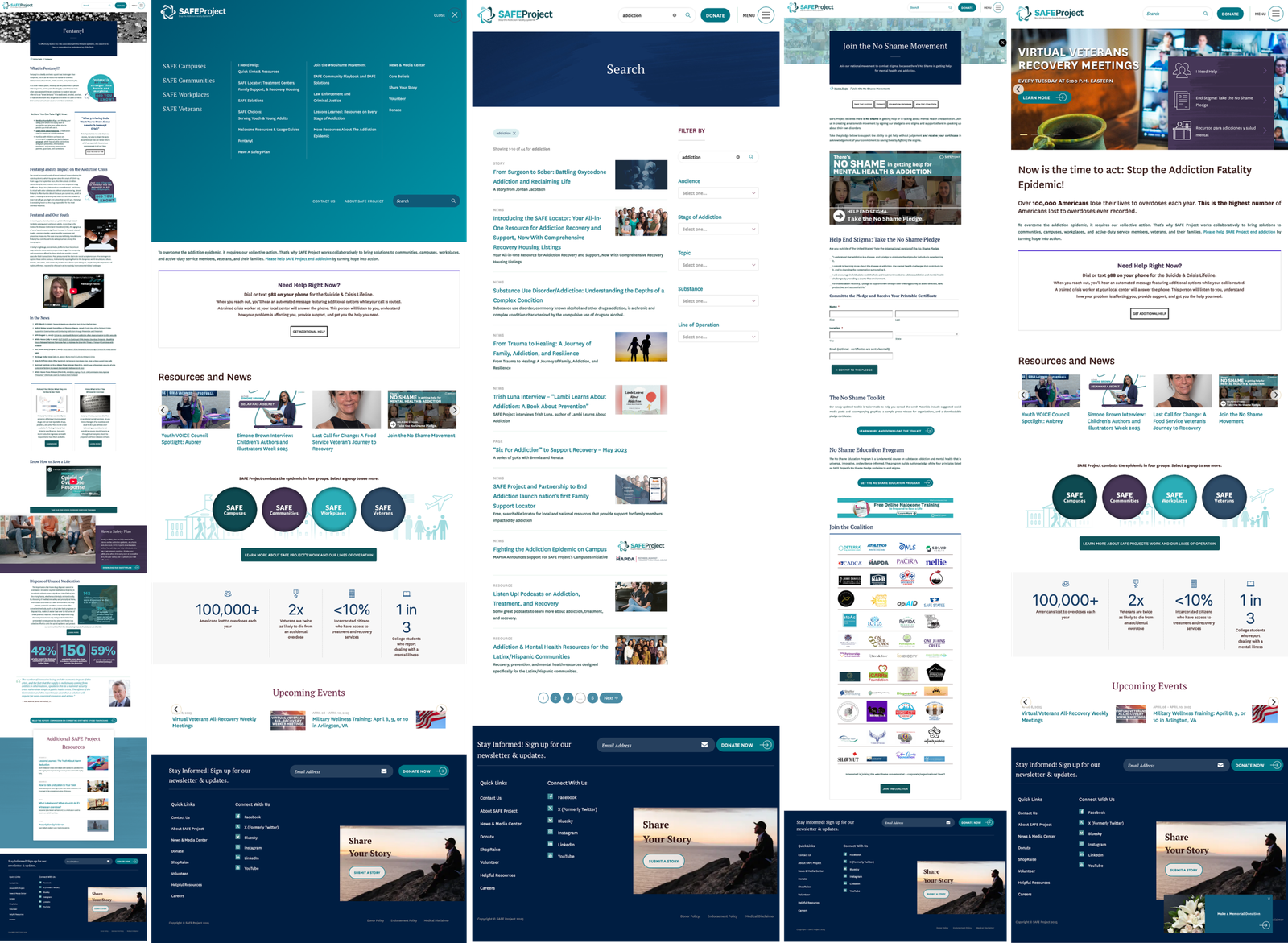
The Redesign
Navigation & Search Discovery
To solve the "information overload" found in the original site, I completely re-engineered the navigation and search experience. The goal was to move away from a basic, static menu to a dynamic system that guides users to the right resources without unnecessary browsing.
The redesign transitioned from a rigid, text-heavy structure to a high-performance experience centered on user discovery and urgent accessibility:
Key Enhancements:
- Customizable Dropdowns: I replaced standard vertical lists with dynamic dropdowns where every menu category is tailored specifically to its content.
- Rich Media Integration: Unlike the old site which only featured internal links, the new dropdowns include intro sections, external links, and featured images to provide essential context before a user even clicks.
- Intuitive Pathways: The navigation is now designed for discovery, allowing users to see sub-pages and related initiatives—such as the Youth Fentanyl Campaign—at a glance, rather than requiring them to know exactly what they are looking for beforehand.
- Priority Footer: I engineered a completely new footer that organizes vast amounts of information into a compact, highly scannable footprint. This includes a permanent "Get Immediate Help" section for the emergency helpline, ensuring crisis support is always accessible and never overlooked.
Search & Filtered Results
Key Enhancements:
- Search Bar with Quicklinks: To reduce typing effort, the search bar now features "Quicklinks" to the most visited resources (e.g., SAFE Locator, Trainings).
- Filtered Results Page: I created a dedicated results template with filter options (by category, date, or program), allowing users to narrow down "SO MUCH STUFF" into a manageable list.
- Terminology Matching: The new system was designed to be more forgiving, moving away from the previous requirement for exact word/spelling matches to ensure users find what they need, even in high-stress moments.
user testing 🦸
Staff & User Feedback
- Success: Staff praised the new standardized portfolio pages, which now clearly note the "audience" for each offering.
- Improvement: The smaller, more modern hero banners were rated as much more professional than the previous "giant blue boxes."
- Impact: The addition of a filterable search results page solved the major frustration regarding site navigation and resource discovery.
Takeaways 🎁
Redesigning the SAFE Project was a profound exercise in balancing dense information with genuine emotional resonance. I learned that true accessibility extends far beyond technical color ratios; it is about ensuring every visitor—especially those from underrepresented communities—feels seen and supported. Responding to user feedback regarding diversity was a pivotal moment for me, leading to the creation of photography guidelines that prioritize authentic representation. This shift turned an overwhelming site into a space where a sense of belonging is as central as the resources provided.
To resolve the "information overload," I replaced rigid, outdated templates with a library of flexible, balanced components. This system empowered the SAFE Project staff to build their own layouts for unique content series like "Lessons Learned" without needing constant design intervention. By moving away from "walls of text," we ensured long-term brand cohesion and significantly reduced the cognitive load for users in high-stress situations.
Collaboration was the engine that made this vision technically feasible. Through daily standups and bi-weekly client reviews, I ensured complex features—like the dynamic navigation and interactive data sections—were optimized for development from the start. This constant communication allowed us to prioritize the "Urgent Path," permanently highlighting the emergency helpline and streamlining headers so that life-saving information is never more than a glance away.
Keep Reading
More examples of design that drives results.